
← Home

Wellness & services · 2026

Making the care visible, before the first appointment.

A brand and digital experience that brings NewU’s services, treatment pathways, and membership offer into one clearer story.

ClientNewU
The workBrand identity · Website · Campaign creative
LocationSan Jose, California
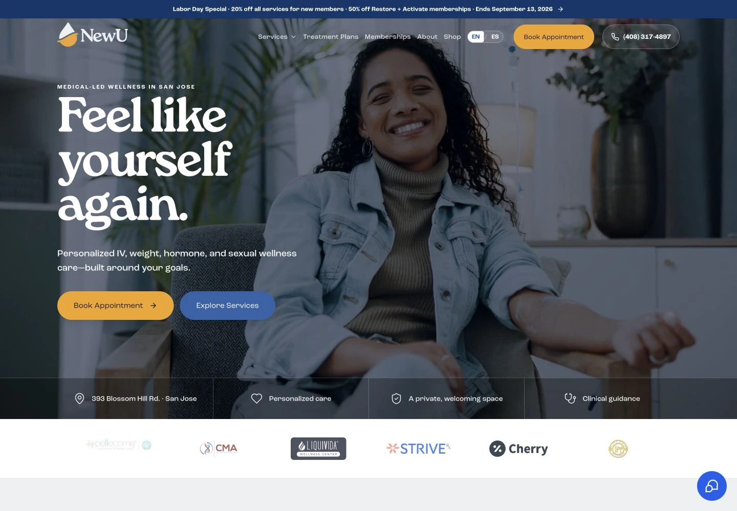
NewU website homepage
The NewU website brings the brand and the first step into care together.

The starting point

A broader offer needed a clearer introduction.

NewU is a wellness business in San Jose. Its offer reaches beyond a single IV session, with treatment pathways, memberships, and provider-guided services. The website and campaign materials need to help a visitor understand those choices without making the first step feel complicated.

Our work brought the brand, website, and campaign presentation together around that customer journey: understand the service, find the relevant pathway, and book a conversation with the care team.

The idea

A customer should understand where to start before they have to ask.

01 / Identity

Warmth, with enough structure to stay consistent.

The identity combines a distinctive wordmark with blue, amber, and green. It gives the team a recognizable language for the website, printed materials, and campaign creative.

The brand kit collects the marks, color system, and typography in one place. That matters when several people are making materials for the same business.
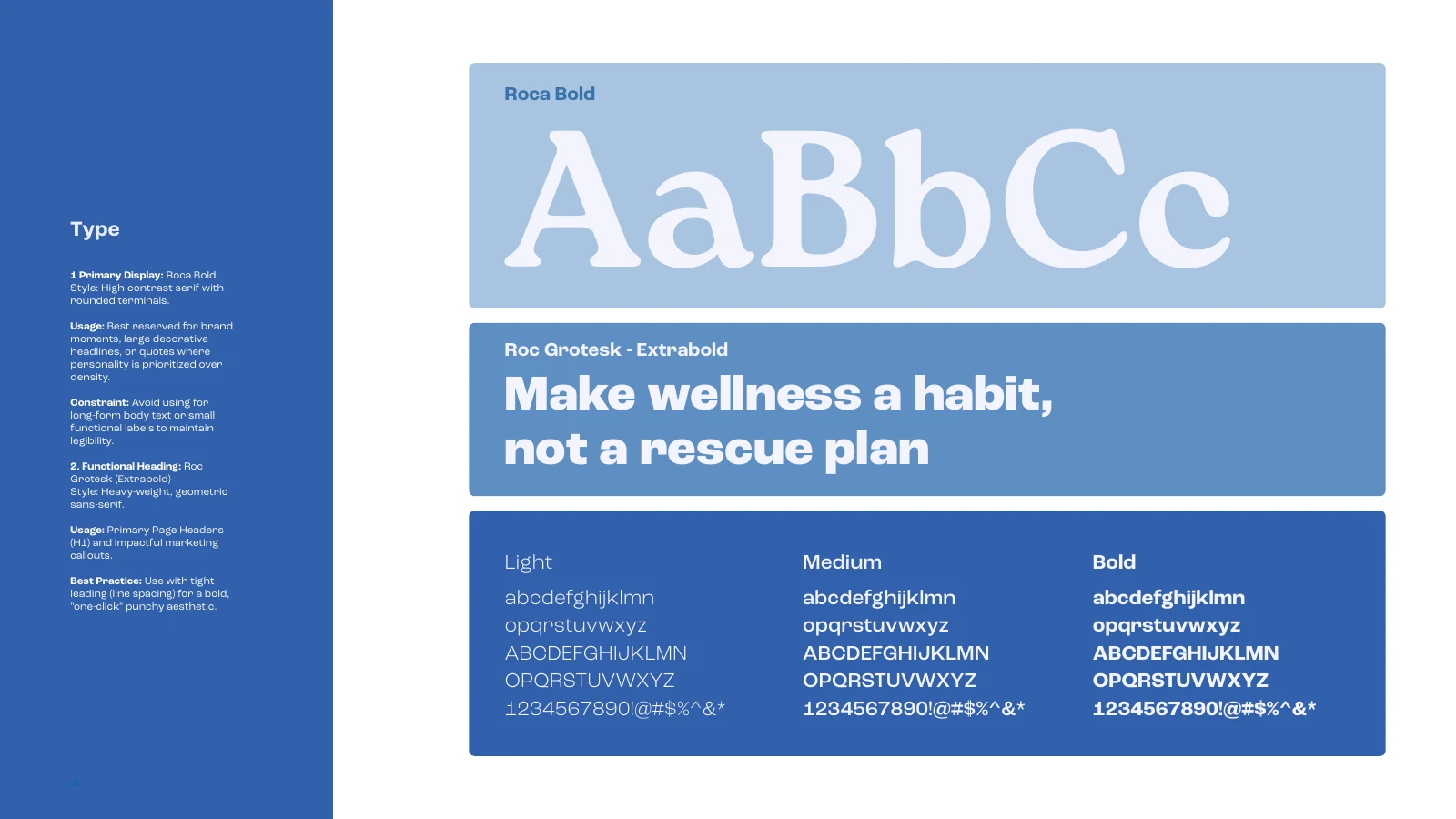
NewU brand typography guidelines
NewU’s typography guidelines: a shared foundation for design across touchpoints.

02 / Customer journey

Make the next step easier to find.

The website organizes services alongside treatment plans and memberships. Visitors can explore the options and move to an appointment booking path.

The same offer needs to make sense after someone leaves the website. Campaign assets and everyday materials carry the identity into the next interaction.

NewU website homepage
The live NewU website, captured September 2026.

03 / Across touchpoints

The small details belong to the same story.

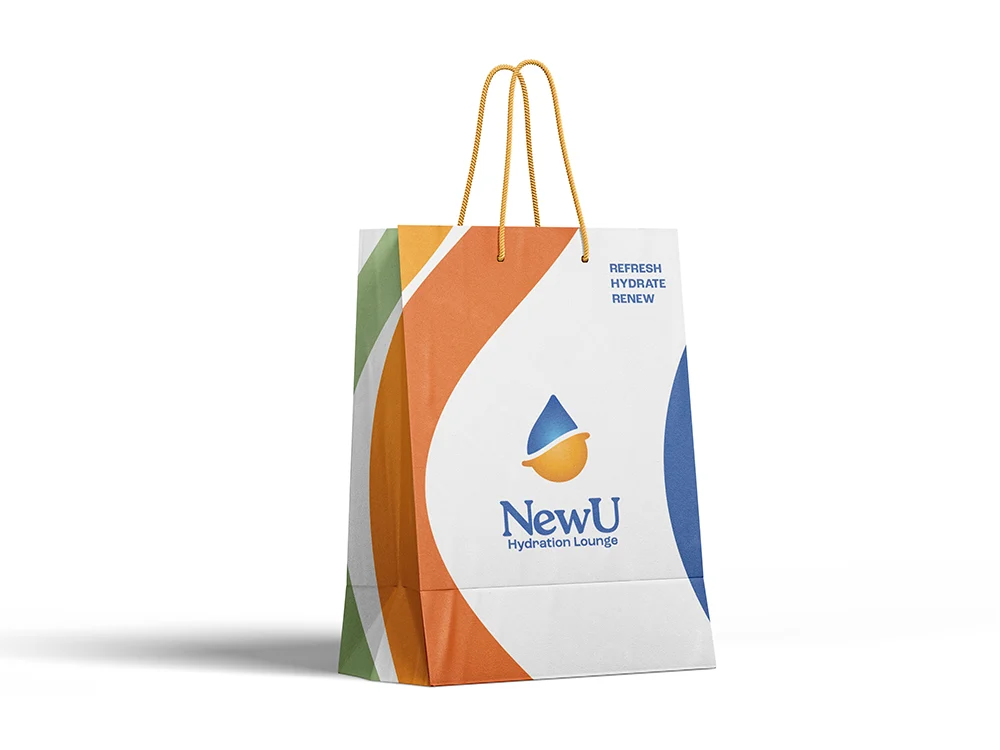
A business card, a brochure, an email footer, and a gift bag all become part of a customer’s impression. The shared project files bring those applications into the same design language.

That is the practical value of a brand system: the next piece starts from an established foundation.

NewU branded gift bag mockup
A physical application of the NewU identity.

The work so far

A clearer front door for the business.

  • A documented identity with reusable logos, colors, and typography.
  • A live website connecting services, treatment plans, memberships, and booking.
  • A family of campaign and physical brand applications.

This case study brings together the identity, website, and campaign work from the 2026 project.

Visit NewU

Keep exploring

Music, culture & events

CIMFEST →

Technology & entrepreneurship

CITS →

Your next step

Let’s find where
your leads slip away.

Bring us the business you’ve built. In 30 minutes, we’ll trace how inquiries reach you today, show you where they get missed, and tell you which option fits.

Book a free 30-minute call

Free · 30 minutes

Prefer to write? Send us your details See pricing